INTERIOR | HOUSING | RENOVATION


Project HALKALI HOUSE | Location İstanbul, Turkey | Date 2018 | Client Private | Status Concept | Size 170 m² | Team Nurşah Kaplan, Büşra Ahıskalı
The employer, who bought one of the upper floor duplex apartments of the complex consisting of duplex apartments in Halkalı, Istanbul, requested to renovate his new house.
The demands stated as priority in the flat; floor coverings, interior doors, electrical – plumbing and radiators were renewed and the existing plaster boards were removed.
Spatial demands are; arranging the entrance design and storage under the stairs, design of the bookcase and tv unit design for the living room, design of the dining area, renovation and redesign of the fireplace, renewal of the existing staircase, design of the separator panel for the neighboring balcony, completely removing the kitchen and wet areas and presenting a new proposal, parent bed room renewal and new usage suggestions, spatial renewal of children’s bedrooms and furniture production for age groups and their needs.
In line with the requests sent to us, a spacious and simple design setup for the space that can meet the needs of the users has been adopted.
1st Floor Plan
The 1st floor of the project includes the entrance area, living room-dining room, kitchen, guest toilet, balcony and stairs. The floor coverings of the entrance area and the kitchen volume were designed together and it was suggested to use white ceramic/marble. With the staircase rising from the living room area, unity was achieved in the floor covering of the living room and dining room, and light gray solid parquet was preferred due to the employer’s request for the original use of light color and material.
2nd Floor Plan
2nd Floor of the Project; It consists of a parent room, a boy’s room, a girl’s room and a bathroom, which are connected to the hall.
The light gray solid parquet that came with the stairs was continued in the hall and continued to be used in the bedrooms. Thus, it was desired that the warm feeling of trust provided by the use of parquet prevails throughout the house. In the general bathroom and en-suite bathroom, the use of white ceramic/marble is preferred.
In order to have a spacious and inviting entrance, it is recommended to use white glossy ceramic/marble primarily in the entrance area. Existing doors have been changed, and the use of white wooden doors has been preferred.
A floor-to-ceiling mirror was used on the wall that first greeted us when entering the house, and a functional dresuar was designed in front of it. The door and the wall opening under the stairs were constructed together, and a secret door was designed here. In this area, dark gray paint was preferred as the color of the furniture covering material.
On the staircase leading to the living room, the light gray solid parquet used in the living room is designed with a joint space in order to continue and emphasize the ‘transitional space’ of the area.
Primarily demanded in living room design; was the renewal of floor coverings with light gray and solid wood products.
In order to create a contrast with the proposed floor covering material, the designed furniture products are thought to be in walnut wood color, and the choice of solid or mdf+- veneer is presented to the employer as two different options, taking into account the cost.
A multi-functional bookcase, which can have shelves, drawers and a cupboard with doors, has been designed with the message of the users that they like to read books together and that each of them has bookshelves in the common area of the house where they can house their books.
In this place, which is the living area of the house, an inward-looking design approach has been adopted in order to provide as spacious and wide use as possible. The TV unit is positioned in the center of the space and separates the living and dining areas.
In sofa upholstery coatings to increase the dynamics of the space and highlight the furniture; striped, woven fabrics in red and gray tones are suggested.
In order to provide the light/dark color balance of the place and to lighten the color transitions, the curtain fabric left on the wall, dark color and small pattern, tulle fabric, light and horizontal pattern were chosen.
Lighting products used in the design; with dark fabric pendant lamp according to the employer’s request for a low light level regional, again with a dark fabric floor lamp, it was preferred considering diffuse lighting.
In the floor covering of the dining room, the light gray-solid wood parquet preferred in the living room was continued and no differentiation was made between the floors of the two areas.
On the deaf wall of the area, a large console/buffet is designed to increase the storage space. A linear beveled mirror is proposed to show the area high and wide. The furniture designed in this area is in walnut wood color and it is thought to be detailed as solid wood or mdf + veneer upon the request of the user.
On the walls of his place; It is suggested to use wallpaper in the dining table section and wall paint in the other sections.
The curtain and tulle fabric preference of the place did not differ from the one recommended for living room use, and the curtain fabric on the wall was chosen with a dark color and small pattern, and the tulle fabric with a light and horizontal pattern.
The pendant chandelier chosen to provide efficient lighting at the dining table is positioned in the center of the dining table and provides direct lighting to the table. The pendant lamp used next to the mirror was chosen for decorative purposes.
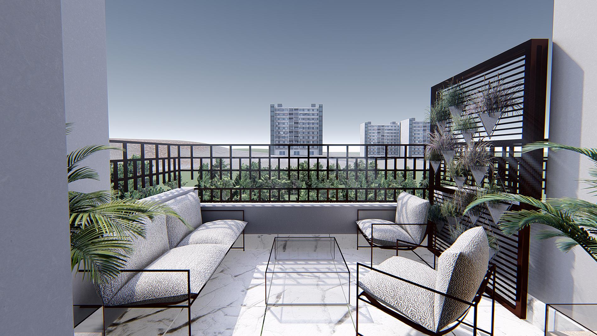
With the renewal of the existing old floor covering of the balcony, it was thought to use white ceramic suitable for outdoor use in the new design.
Requests of the users other than the renewal of the balcony floor and electrical installation; A dividing element has been designed to break the visual ties with the neighboring balcony. With the idea of transforming the designed steel panel into a decorative vertical garden as well as separating it, it is suggested to be used together with hanging flower pots.
It is preferred that the lighting elements are suitable for outdoor and adjustable.
Since the house is only in a distant visual connection with the green and there is almost no contact with the green, the use of green in this area of the house has been increased, and it has been suggested to use trees that can adapt to outdoor conditions in all seasons and can be grown in pots.
It was requested to renew and redesign the WC area, primarily the water and electrical installations. In order to design a bright and spacious appearance compared to its current state, the use of white glossy ceramic was preferred for the floor covering. The ceramics used on the floor were continued on the walls, but continuity was not provided along the wall in order not to give a monotonous effect to the space.
In the designed bathroom cabinet, functionality is kept in the foreground and storage areas are increased. Oak veneer on MDF is preferred for furniture details. In the counter color, black marble was used as a horizontal contrast is needed in the space.
With the mirrored cabinet design above the counter, the storage space has been increased without visually narrowing the space.
With the luminaires fixed on both sides of the cabinet, it is aimed to increase the brightness level of the image formed in the mirror and to reduce the shadow formation.
The oval washbasin for countertop use has been preferred for both aesthetic and hygienic concerns. Over-the-counter or under-counter sink options have been studied according to the user’s request.
All bathroom products used in its design; Vitra products were preferred for toilet bowls, concealed cisterns, faucets and accessories.
At the request of the users, a design has been developed to renew the cabinets and floor coverings without changing the operating system of the kitchen.
It is suggested to use white glossy ceramic as floor covering.
Cabinet designs are designed as handleless and a modern and simple look has been tried to be achieved. White and gray lacquer paint on MDF is preferred for cabinet doors.
Between the bench and the bench, the general simplicity of the design is continued and a white quartz bench is used.
In kitchen design, Creavit or Franke options are offered as sink kitchen faucets.
The counter top cabinets of the place are designed with white lacquered doors without handles.
The use of Franke granite sinks in countertop design has been suggested.
Attention was paid to the light-colored monolithic design between the counter and the counter, and Belenco’s Calacatta Veneto with gray veins on white was preferred as the quartz counter recommendation.
Handles are not used in under-bench cabinets and drawers. It is thought that the covers will be produced in gray matte lacquer paint. In addition, it is recommended to use steel mechanisms in cabinet, drawer and pantry systems.
While the furniture design of the room, which is designed for 6-year-old girls of the users, will continue between the ages of 6-18, the room has been designed with the flexibility to meet the needs of different ages. With the change of age, the furniture will remain fixed and only the decor of the room will have to be changed.
- The floor coverings of the designed room were determined as light gray solid, as in the other living areas, and the furniture details were determined as white matte lacquer paint on MDF and wood oak veneer.
- At the request of the little user, the main color of the room was decided to be pink.
- In the bedside lighting, pink-white-gray colors, which are the concept colors of the room, are included.
- Due to the small amount of storage space in the room, it was decided to design this area as a drawer or rail cover in order to make the use of under the bed efficient.
- The use of princess tulle over the bed is recommended in the 6-year-old recommendation.
While the furniture design of the room, which is designed for 6-year-old girls of the users, will continue between the ages of 6-18, the room has been designed with the flexibility to meet the needs of different ages. With the change of age, the furniture will remain fixed and only the decor of the room will have to be changed.
- The floor coverings of the designed room were determined as light gray solid, as in the other living areas, and the furniture details were determined as white matte lacquer paint on MDF and wood oak veneer.
- The room is primarily designed by dividing it into different areas. These are designated as reading and playing area, working area, sleeping area and dressing area.
- In the playground, shelves designed for the storage of toys,
- It will also be able to respond to different functions such as a library for the needs of different ages.
- The picture with the wire board on the carrier leg of the work table,
- An area has been designed where desired items such as memorabilia and notes can be hung and exhibited
Light gray solid parquet was used for the floor coverings of the room, which was intended to be designed for 13-year-old boys.
The sleeping part of the room is defined by the color change made on the wall and the laths, and the dressing, library and work area that the user needs are designed together. White lacquer paint on MDF was preferred for the designed furniture.
In the designed room concept, the main colors are blue and white, and an effort was made to create a dynamic effect by using linear spaces, laths and mirrors in the furniture.
In the room, the modern interpretation of the industrial style and the use of bronze-plated lighting products were preferred.
The increase in the time spent indoors due to modern living conditions has brought not only the physiological but also the psychological needs of the spaces. With this approach; With the orange single swing positioned at the end of the bed, it was desired to revitalize the space and change the atmosphere of the room.
The chair, located in front of the work desk, has been chosen as a fabric in order to support a comfortable working environment in a frame suitable for the simple furniture design setup of the room.
The flooring material used in the master bedroom is light gray solid parquet.
Its design was first started with the inclusion of the bay window into life. In this area, with the idea that users like to read books, a sofa was designed above the radiator, making the appearance of the radiator aesthetically pleasing and a pleasant reading corner designed.
Other furniture designed are bedside tables and make-up tables. Gray matte lacquer paint on MDF and dark oak veneer are preferred for furniture.
In the designed bed head area; By using a modern, geometric patterned wallpaper, the bedroom area is defined as modest, and the designed wall is continued with paint and a corner mirror. The lampshade and pendant lamp used at the head of the bed are detailed with wooden elements in order to be an indirect light source and to adapt to the space, taking care not to give direct light to the eye.
The bathroom area, primarily the water and electrical installations, was requested to be renewed and redesigned. In order to design a bright and spacious appearance compared to its current state, the use of white glossy ceramic was preferred for the floor covering. The ceramics used on the floor were continued on the walls, but continuity was not provided along the wall in order not to give the space a monotonous effect.
Functionality is prioritized in the designed bathroom cabinet. Areas such as the washing machine, detergent dispenser and dirty basket have been designed and the storage area has been increased. Oak veneer on MDF is preferred for furniture details. Black marble is suggested for the counter color.
With the countertop mirrored cabinet design, the storage space has been increased without visually narrowing the space.
With the luminaires fixed on both sides of the cabinet, it is aimed to increase the brightness level of the image formed in the mirror and to reduce the shadow formation.
The toilet, which the users stated that they would like to be located only in the general bathroom area; It is Güral Vit’s WC Health product, which has the Red Dot Design Award in order to minimize health and hygiene concerns.
The oval washbasin for countertop use has been preferred for both aesthetic and hygienic concerns. Over-the-counter or under-counter sink options have been studied according to the user’s request.
Vitra products were preferred in the fixtures and accessories used in its design.